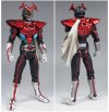
Thought: Showa Riders in Heisei style

I like those designs even with the muted colors. Though The Next's colors definitely look more Kamen Rider than The First's.

Shame about the exposed neck, but hey.

The one thing I wish they'd done for the recent crossover movies is to dial back the nostalgia a bit and give the older riders the same treatment Apollo Geist got in Decade. By that I mean, update the suit materials so they don't look so shabby and glued together and give the designs a little flourish to reflect their well-earned bigger budget these days.
I never minded the exposed neck. After all, Ichigo and Amazon's first helmets had open mouths so you could see the face of the guy inside. I was watching Skyrider recently and a lot of the 'teardrops' are transparent enough to see the suit actors' eyes through them. So it's not like the First/Next designs were the first to have exposed areas. I do think Decade missed a trick by not using the alternate dimensions idea to have the original versions meet the movie versions.

Kabuto probably gives a good insight as to what a "heisei-ised" Stronger would be like. Given how much Tendou seems inspired by Jo, and they're both based on the same beetle, it seems likely Stronger would end up looking similar. I can imagine Super-1 incorporating a two-switch belt somewhat similar to Nadeshiko's in order to change his arm modules, or Riderman having something not unlike the Birth system.
 
Or we could just look at the SIC designs for the Showa era riders. That Stronger looks less like he's wearing football pads and more like chitinous armour. Which is pretty bad ass.

2616.avif
 
Heisei-style Riderman helmet
tumblr_m8ts2fRjjJ1rww810o1_500.jpg


I think the Riderman design itself would go really well with a western audience if it ever had an upgrade.
You could easily place him next to any US superhero, and he wouldn't stand out.
 
I never minded the exposed neck. After all, Ichigo and Amazon's first helmets had open mouths so you could see the face of the guy inside.

The exposed neck actually was in the original series and even the beginning of V3. They only started completely covering their necks later. The remake movies made it more obvious though, in order to make it stand out.

The one thing I wish they'd done for the recent crossover movies is to dial back the nostalgia a bit and give the older riders the same treatment Apollo Geist got in Decade. By that I mean, update the suit materials so they don't look so shabby and glued together and give the designs a little flourish to reflect their well-earned bigger budget these days.

They likely won't do it, not just because of nostalgia, but they just couldn't remake all 10 (or 12 if we include Black and RX) Showa suits at once. I think the only chance of that happening is another crossover tv show, but this one covering the entire franchise since the beginning, since they could recycle monster suits for some episodes and then use the budget that would go to them to make redesigned costumes for the Showa Riders.
 
Personally, I'd be a little bit more interested in seeing updated versions of classic Sentai outfits then I would Kamen Rider.

Which isn't to say that I wouldn't mind taking a gander at a revamped version of Amazon, Black, and Black RX's designs
 
Or we could just look at the SIC designs for the Showa era riders. That Stronger looks less like he's wearing football pads and more like chitinous armour. Which is pretty bad ass.

2616.avif

This is second SIC redesign I like. (first one being Dark Kiva). Definitely much better than original, that couldn't even be forgiven with "product of it's time" excuse.
 
Stronger's original design works when he's the main hero. The costume is over the top and attention catching, but so is Stronger himself with his over the top attitude and all those "just as planned" moments. The big helmet doesn't stand out that much either due to his big chest protector.

However, when you place him as just another Rider among many, not only the different proportions and oversized helmet are highlighted, but the costume itself often just looks out of place and kind of dumb considering how Stronger won't get to show much of his atittude. So, you just get this Rider in the background with a seemingly oversized life vest and helmet. Another problem is that in those secondary appearances Stronger often ends up with smaller suit actors. A taller suit actor really helps making the proportions of Stronger's suit work alongside the other Riders, but a smaller one just highlights all the proportion issues.
 
Last edited:
Yeah, which I guess is why I object heavily to the "better than the original" most of all.

It's ENTIRELY about context, and in context, Stronger's costume works perfectly. Out of context, in pointless crossovers where he's just a random suit hanging around...
 
You really can't argue that the proportions look incredibly strange on an otherwise humanoid figure. The head IS oversized and the shoulders ARE huge. If they looked like they could actually afford some protection (as in the SIC design) I'd probably take to it a lot more.

The design itself (especially the helmet) look really cool. But it's so disproportionate as to have a pseudo-uncanny-valley effect on me.
 

Latest News & Videos

Latest News

Back
Top