BigMac1212
New Member
Apparantly, a new look is needed to help the Detorit Lions. Basically, there's a face and mane on the leaping Lion logo.
Here's the photo gallery from the Lions' site:
Lions logo unveiling
The logo's nice, and the uniforms are pretty good, but there's 2 gripes about the helmet:
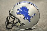
1: Like the Buffalo Bills, there's too many color stirpes.
2: The black face mask doesn't fit. Heck, a grey facemask would do the job.
What do you guys think.
Here's the photo gallery from the Lions' site:
Lions logo unveiling
The logo's nice, and the uniforms are pretty good, but there's 2 gripes about the helmet:
1: Like the Buffalo Bills, there's too many color stirpes.
2: The black face mask doesn't fit. Heck, a grey facemask would do the job.
What do you guys think.